Comment management
About the product
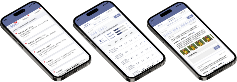
Designing a mobile comment management system involves creating an intuitive interface with two main functions: Comment Statistics and Comment Details and Replying. The statistics function features an overview dashboard with key metrics, visualizations, and customizable filters. The comment details function displays threaded comments, enabling direct replies and edits. The system is optimized for performance with real-time updates and scalability.
Essential and simple
Get in touch with customers
Product reviews are vital for vendors, offering insight into customer satisfactionand influencing other buyers.
Quickly understanding feedback helps vendors stay connected and create a thoughtful buying experience.
The push time is intentionally scheduled for 5 minutes to maintain shop owners' workflow.
Clicking the push directs users to reply to specific comments.
A predetermined period allows users to easily view relevant data.
They can also customize the period with a clear start-end date selection.
Fitting what matters
Keep only the essentials.
On small devices like phones, it's essential to avoid unnecessary information and focus on what's necessary.
To do this, I removed filters, buttons, and columns from certain pages.
Remove unnecessary filters like "customers reply" and "shop reply" from the stats page,
while keeping the column headers visible when scrolling.
Natural viewing by eliminating
The previous system header had columns like "number of no-replies" and "number of replies" that required users to scroll right to see.
I removed these as they weren’t useful for vendors and disrupted the viewing experience.
Oh no and it’s ok!
Error allowance and proof
Since vendors won't be focusing entirely on a single comment,
it's important to allow some flexibility in replies and limit
the number of times they can edit their responses.
A confirmation alert for replies ensures safer and more cautious responses.
Knowing the users and making things better
Since this product is a redesign of the previous comment management system tailored for different users, I streamlined and repositioned many functions to achieve a more minimalist and aesthetic design. For instance, in the previous version, users had to scroll horizontally on the stats page to view all the information, which was impractical for a mobile app.